This code is based on the Tcl ttkbut.tcl demo. The available Ttk themes are displayed in the Themes panel; clicking a button changes the overall theme of the window.
Wednesday, July 25, 2012
Tkinter Labelframe Demo
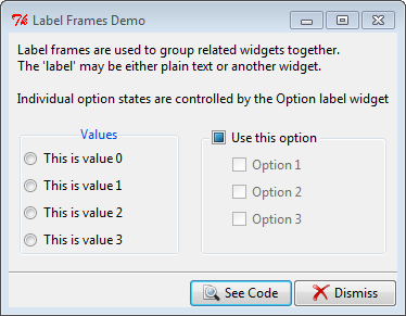
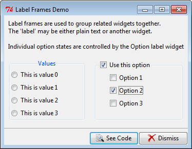
This code is based on the Tcl labelframe.tcl demo. There's very little you can configure on a ttk.Labelframe (border, relief, etc. aren't available). You can; however, re-position the frame title text using combinations of N, S, E, W or you can use an entirely separate widget via the labelwidget option.
Labels:
Tkinter Demos,
Tkinter Windows
Tkinter Image Viewer Demo
This code is based on the Tcl image2.tcl. I've made a few minor changes to the original; used PIL for the image handling and added a filetype filter to limit the types of files that will appear in the Files listbox.
Labels:
Tkinter Demos,
Tkinter Misc Examples
Tuesday, July 24, 2012
Tkinter Image Labels Demo
This code is based on the Tcl image1.py demo. Note that if you want to show non-gif images you'll need to use the Python Imaging Library (PIL ... see the code in Tkinter Demos for an example of usage.) A Python 3 version is available from the University of California, Python Extensions site.
Labels:
Tkinter Demos,
Tkinter Label
Tkinter Icon Buttons Demo
This code is based on the Tcl icons.py demo. The interesting bit was in styling the Checkbuttons. In the original demo both appeared as buttons without the 'checkbox' indicators; one appeared sunken when selected, the other had it's background colour changed.
ttk.Checkbuttons do not have the indicatoron option so how to get rid of the 'checkbox' was a bit of a head scratcher which turned out to have a surprisingly simple solution. By setting the style to TButton (vs TCheckbutton) the 'checkbox' disappears; then, when the checkbutton is selected, the style is set to Toolbutton to get the 'sunken button' appearance. The buttons also display a different image depending on their state.
Labels:
Tkinter Buttons,
Tkinter Demos
Monday, July 23, 2012
Tkinter 15 Puzzle Demo (Placer Geometry Manager)
This code is based on the Tcl puzzle.tcl demo which creates a square with 15 numbered buttons and an empty space which allows the numbers to be moved around one at a time; the goal being to get all the button tiles into proper numerical order.
It's actually a pretty good demonstration of the Placer Geometry Manager which allows widgets to be precisely placed relative to the top, left corner of their containing, or ancestor, frame.
Labels:
Tkinter Demos,
Tkinter Misc Examples
Tkinter Radiobutton Demo
This code is based on the Tcl radio.tcl demo modified to use ttk.Radiobutton and excluding the 'tristate'option (see the Checkbutton Demo if you're interested in knowing how 'tristate' works with ttk widgets.)
Also, I've used a different graphic for the image label. The original demo used a built-in bitmap, questhead. Using a tkinter Label, built-in graphics can be loaded by assigning label['bitmap']='built-in image name'; the bitmap option is not available to ttk.Label. Neither is the winfo_reqheight option, so, while I've used a different graphic due to the limitations of ttk.Label, in the end I opted to stick with a standard tkinter Label in order to retain full control over the Label resizing properties. When a ttk.Label is used the label grows and shrinks based on the position of the graphic (top, left, etc) which I find distracting.
Similar resize behaviour happens when the Point size is set to one of the larger values; unfortunately, I couldn't find a way to prevent the resizing ... hopefully I'll trip over it one day.
Also, I've used a different graphic for the image label. The original demo used a built-in bitmap, questhead. Using a tkinter Label, built-in graphics can be loaded by assigning label['bitmap']='built-in image name'; the bitmap option is not available to ttk.Label. Neither is the winfo_reqheight option, so, while I've used a different graphic due to the limitations of ttk.Label, in the end I opted to stick with a standard tkinter Label in order to retain full control over the Label resizing properties. When a ttk.Label is used the label grows and shrinks based on the position of the graphic (top, left, etc) which I find distracting.
Similar resize behaviour happens when the Point size is set to one of the larger values; unfortunately, I couldn't find a way to prevent the resizing ... hopefully I'll trip over it one day.
Labels:
Tkinter Buttons,
Tkinter Demos
Subscribe to:
Posts (Atom)