This code is based on the Tcl entry2.tcl demo. It displays 3 basic, single line entry fields, each with their own horizontal scrollbar.
Sunday, July 29, 2012
Tkinter Treeview Demo
This code is based on the Tcl tree.tcl demo with reference to the Python example, dirbrowser.py. The Tcl demo displays all system drives and all directories and files. There doesn't appear to be a simple Pythonic way to do the same and, as the main intent is to demonstrate building a tree hierarchy, I've opted to only display the current working directory.
Labels:
Tkinter Demos,
Tkinter Treeview
Thursday, July 26, 2012
Tkinter Multi-Column List Demo
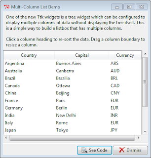
This code is based on the Tcl mclist.tcl demo, and, gratefully, demo code at svn.python.org. While the demo is for a list it is actually based on the ttk.Treeview widget and not a listbox.
Tkinter assigns the same identifier to the values in each column of the same row. For example, Argentina, Buenos Ares and ARS all have I001 as their identifier while the United States, Washington, DC and USD all have the identifier I00F. When sorting a column, you only need to move the selected column values, tkinter handles moving related items in the same row.
Tkinter assigns the same identifier to the values in each column of the same row. For example, Argentina, Buenos Ares and ARS all have I001 as their identifier while the United States, Washington, DC and USD all have the identifier I00F. When sorting a column, you only need to move the selected column values, tkinter handles moving related items in the same row.
Labels:
Tkinter Demos,
Tkinter Treeview
Tkinter Listbox Famous Sayings Demo
This code is based on the Tcl sayings.tcl demo; it demonstrates the use of both Horizontal and Vertical scrollbars within a Listbox as well as resizing properties; when the window is maximized the listbox is given the extra space.
Labels:
Tkinter Demos,
Tkinter Listbox
Tkinter Listbox Colours Demo
This code is based on the Tcl colors.tcl demo. Note that the colours you get are not always those you'd think you'd see given the colour name. You may also want to check out John Grayson's colorswatch.py
Labels:
Tkinter Demos,
Tkinter Listbox
Tkinter Listbox States Demo
The code is based on the Tcl states.tcl demo. It presents a simple Listbox populated with the names of the US States. Currently there is no ttk.Listbox; however, the ttk.Scrollbar can be used with the tkinter Listbox widget.
Labels:
Tkinter Demos,
Tkinter Listbox
Wednesday, July 25, 2012
Tkinter Themes Demo
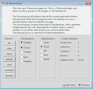
This code is based on the Tcl ttkbut.tcl demo. The available Ttk themes are displayed in the Themes panel; clicking a button changes the overall theme of the window.
Labels:
Tkinter Demos
Tkinter Labelframe Demo
This code is based on the Tcl labelframe.tcl demo. There's very little you can configure on a ttk.Labelframe (border, relief, etc. aren't available). You can; however, re-position the frame title text using combinations of N, S, E, W or you can use an entirely separate widget via the labelwidget option.
Labels:
Tkinter Demos,
Tkinter Windows
Tkinter Image Viewer Demo
This code is based on the Tcl image2.tcl. I've made a few minor changes to the original; used PIL for the image handling and added a filetype filter to limit the types of files that will appear in the Files listbox.
Labels:
Tkinter Demos,
Tkinter Misc Examples
Tuesday, July 24, 2012
Tkinter Image Labels Demo
This code is based on the Tcl image1.py demo. Note that if you want to show non-gif images you'll need to use the Python Imaging Library (PIL ... see the code in Tkinter Demos for an example of usage.) A Python 3 version is available from the University of California, Python Extensions site.
Labels:
Tkinter Demos,
Tkinter Label
Tkinter Icon Buttons Demo
This code is based on the Tcl icons.py demo. The interesting bit was in styling the Checkbuttons. In the original demo both appeared as buttons without the 'checkbox' indicators; one appeared sunken when selected, the other had it's background colour changed.
ttk.Checkbuttons do not have the indicatoron option so how to get rid of the 'checkbox' was a bit of a head scratcher which turned out to have a surprisingly simple solution. By setting the style to TButton (vs TCheckbutton) the 'checkbox' disappears; then, when the checkbutton is selected, the style is set to Toolbutton to get the 'sunken button' appearance. The buttons also display a different image depending on their state.
ttk.Checkbuttons do not have the indicatoron option so how to get rid of the 'checkbox' was a bit of a head scratcher which turned out to have a surprisingly simple solution. By setting the style to TButton (vs TCheckbutton) the 'checkbox' disappears; then, when the checkbutton is selected, the style is set to Toolbutton to get the 'sunken button' appearance. The buttons also display a different image depending on their state.
Labels:
Tkinter Buttons,
Tkinter Demos
Monday, July 23, 2012
Tkinter 15 Puzzle Demo (Placer Geometry Manager)
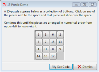
This code is based on the Tcl puzzle.tcl demo which creates a square with 15 numbered buttons and an empty space which allows the numbers to be moved around one at a time; the goal being to get all the button tiles into proper numerical order.
It's actually a pretty good demonstration of the Placer Geometry Manager which allows widgets to be precisely placed relative to the top, left corner of their containing, or ancestor, frame.
It's actually a pretty good demonstration of the Placer Geometry Manager which allows widgets to be precisely placed relative to the top, left corner of their containing, or ancestor, frame.
Labels:
Tkinter Demos,
Tkinter Misc Examples
Tkinter Radiobutton Demo
This code is based on the Tcl radio.tcl demo modified to use ttk.Radiobutton and excluding the 'tristate'option (see the Checkbutton Demo if you're interested in knowing how 'tristate' works with ttk widgets.)
Also, I've used a different graphic for the image label. The original demo used a built-in bitmap, questhead. Using a tkinter Label, built-in graphics can be loaded by assigning label['bitmap']='built-in image name'; the bitmap option is not available to ttk.Label. Neither is the winfo_reqheight option, so, while I've used a different graphic due to the limitations of ttk.Label, in the end I opted to stick with a standard tkinter Label in order to retain full control over the Label resizing properties. When a ttk.Label is used the label grows and shrinks based on the position of the graphic (top, left, etc) which I find distracting.
Similar resize behaviour happens when the Point size is set to one of the larger values; unfortunately, I couldn't find a way to prevent the resizing ... hopefully I'll trip over it one day.
Labels:
Tkinter Buttons,
Tkinter Demos
Sunday, July 22, 2012
Tkinter Checkbutton Demo
This code is based on the Tcl check.tcl demo, modified to use ttk.Checkbutton. A ttk.Checkbutton does not have the same options as a standard tkinter checkbutton; in particular, the tristatevalue option referenced in the original demo is missing.
The option determines the value of a checkbutton when it is neither checked (onvalue) nor unchecked (offvalue); it corresponds to the alternate visual state for display purposes. As nothing prevents you from assigning an invalid value to a checkbutton I was able to indirectly mimic the behaviour found in the original demo (see _value_changed and _safety_changed methods in code below). The screenshot on the right shows how the Safety checkbutton's alternate state looks under Windows 7.
The original demo displays the checkbutton control variables in a separate window via a See Variables button. I've chosen to display them in a separate panel along side the checkbuttons themselves.
checkbutton $w.b0 -text "Safety Check" \
    -variable safety -relief flat \
    -onvalue "all" \
    -offvalue "none" \
    -tristatevalue "partial"
The option determines the value of a checkbutton when it is neither checked (onvalue) nor unchecked (offvalue); it corresponds to the alternate visual state for display purposes. As nothing prevents you from assigning an invalid value to a checkbutton I was able to indirectly mimic the behaviour found in the original demo (see _value_changed and _safety_changed methods in code below). The screenshot on the right shows how the Safety checkbutton's alternate state looks under Windows 7.
The original demo displays the checkbutton control variables in a separate window via a See Variables button. I've chosen to display them in a separate panel along side the checkbuttons themselves.
Labels:
Tkinter Buttons,
Tkinter Demos
Saturday, July 21, 2012
Tkinter Button Demo
This code is based on the Tcl button.tcl demo, modified to use ttk.Button and its associated ttk.Style.
Four buttons are presented, the panel background is changed to match the selected button's colour name.
The original demo uses the option -highlightbackground to change the button colour to match the selected background colour; ttk.Button does not have a highlightbackground option, instead, we need to change the ttk.Button style. To ensure that only the demo buttons are changed (and not all buttons), we clone the original button style, TButton, as Demo.TButton; assign it to each button in the demo panel, and then modify it.
On the left is the button appearance if the button background is not modified to match the selected demo panel background; on the right, the button`s appearance once it`s background has been set by modifying it`s associated style.
Labels:
Tkinter Buttons,
Tkinter Demos
Friday, July 20, 2012
Tkinter Label Demo
This code is a conversion of the Tcl label.tcl Demo.
Pressing the See Code button opens up the Python source code file.
Pressing the See Code button opens up the Python source code file.
Labels:
Tkinter Demos,
Tkinter Label
Tkinter demos
The tkinter demos that ship with the Python 3 install are in the tcl\8.5\demo directory, however; they are all tcl files! And well there are a number of decent tkinter reference sites available: TkDocs, tkinterbook, Tkinter 8.4 Reference, and A Tour of Tkinter Widgets, it's hard to find recent, full working examples of various things tkinter so I've decided to take a crack at converting the tcl demos myself; mainly as a learning experience but hopefully they'll be useful to others as well.
To begin with, the demos each appear in a window with three panels: a top panel describing the demo, a middle panel with the widgets being demonstrated and a bottom button panel. As the top and bottom panels are essentially the same across the board, I've split the code into a separate file: demopanels.py.
Also included is a CodeDialog class for the display of the demo's source code. It creates a modal dialog window with a scrolled text widget and cancel button.
This file will be imported into subsequent demos.
Labels:
Tkinter Demos
Subscribe to:
Comments (Atom)


